Menus
Blender uses a variety of different menus for accessing options and tools.
Header Menus

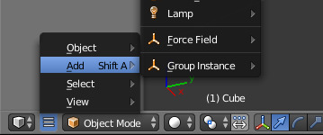
The Info Editor menu buttons.
Most headers exhibit a set of menus, located immediately next to the first Editor Type selector. Header menus are used to configure the editor and access tools. All Menu entries show the relevant shortcut keys, if any.
Collapsing Menus
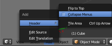
Sometimes it’s helpful to gain some extra horizontal space in the header by collapsing menus,
this can be accessed from the header context menu,
simply RMB click on the header and enable it to collapse.
Select Menus

The 3D View mode select menu.
The Select menu or short selector lets you choose between a set of options. They can show a text and/or a icon. The options are shown in a pop-up. The selected option is then shows as active.
Pop-Up Menus

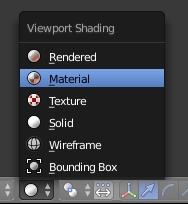
The Viewport Shading pop-up menu.
Pop-up menus are overlays. They are spawned by menus showing up and down triangles on the right or after a key input at the mouse position.
If the content is too large to fit on the screen, small indicator triangles appear. When moving the mouse over them scrolls the pop-up.
For example, the Viewport Shading button will produce a pop-up menu with the available shading options.
- Mouse selection
LMBon the desired item.- Numerical selection
- You can use the number keys or
Numpadto input an item in the list to select. For example,Numpad-1will select the first item and so on.
Pop-ups can be moved by dragging their title.
Shortcuts
- Use
Wheelwhile hovering with the mouse. - Arrow keys can be used to navigate.
- Each menu item has an underlined character which can be pressed to activate it.
- Number keys or numpad can be used to access menu items.
(Where
1is the first menu item,2the second... etc. For larger menusAlt-1the 11th... up toAlt-0the 20th) - Press
Returnto activate the selected menu item. - Press
Escto cancel the menu, or move the mouse cursor far from the pop-up, or byLMBclicking anywhere out of it.
Context Menu
Context menus are pop-ups opened with the RMB.
Only the common options are listed below:
Single sets or gets the value of the button under the mouse pointer. All on the other hand includes all combined buttons.
- Reset All/Single to Default Value(s)
- Replaces the current value by the default
Backspace. - Unset
- ToDo
- Copy Data Path
- For scripting – Copies the Python path of the property, relative to the data-block.
- Copy To Selected
- Copies the property value to the selected object’s corresponding property. A use case is if the Properties editor context is pinned.
- Add Shortcut
- Lets you define a keyword or mouse shortcut and associates it with the control. To define the shortcut you must first move the mouse cursor over the button that pops up, and when “Press a key” appears you must press and/or click the desired shortcut.
- Change Shortcut
- Lets you redefine the shortcut.
- Remove Shortcut
- Unlinks the existing shortcut.
- Online Manual
- See Context Sensitive Manual Access.
- Online Python Reference
- Context-sensitive access to the Python API Reference.
- Edit Source
- For UI development – Creates a text data-block with the source code associated with the control, in case the control is based on a python script. In the Text Editor it points at the code line where the element is defined.
- Edit Translation
- For UI development – Points at the translation code line.
See also
Specials Menu
The Specials pop-up menu contains a context-sensitive list of operators.
It is opened by a button with a down arrow on dark background  or
with
 W in most editors giving quick access to tools sensitive to the editors mode.
Pie Menus
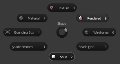
A pie menu is a menu whose items are spread radially around the mouse. Pie menus have to be activated in the User Preferences through Add-ons ‣ UI ‣ Pie Menus Official.
Interaction
The pie menu is spawned by a key press, which are listed in the Add-on Preferences.
Releasing the key without moving the mouse will keep the menu open and the user can then move the mouse pointer towards the direction of a pie menu item and select it by clicking. Releasing the key after moving the mouse towards a pie menu item will cause the menu to close and the selected menu item to activate.
An open disc widget at the center of the pie menu shows the current direction of the pie menu. The selected item is also highlighted. A pie menu will only have a valid direction for item selection, if the mouse is touching or extending beyond the disc widget at the center of the menu.
Pie menu items support key accelerators, which are the letters underlined on each menu item. Also number keys can be used to select the items.
If there are sub-pies available, it is indicated by a plus icon.
See Pie menu settings.


